Thursday, October 28, 2010

Foshay Tower Assignment


            Well, this is what I have so far.  For this one I tried to make it look like a cartoon, it took a while to get it to look like this but I think it looks really good.

Then, in this one I wanted it to look like a postcard so I combined a few pictures and edited them a little bit to make them more saturated and chaned the color a little bit.

    This one I haven't finnished yet, there are still a few things that I wanted to do before I color it in so I'll have to update this one later.  For the outline on this one I used the one from the first picture then stretched it a little bit, found a drawing of a bird then outlined that but like i said earlier I'm not done yet so I'll update this later.

Thursday, October 14, 2010

Metaphors We Live By

       I don't know I though it was kinda interesting to find out just how often we use metaphors and don't even realize it.  The discussion in chapter two about time was interesting because it pointed out the fact that our entire society is using these metaphors all the time.

Thursday, October 7, 2010

Homework Assignment

Business Card


   I tried to make this card as simple as possible but still look like something that I would like so the butterflies in the background. Plus, I thought it would be a good idea to have only a few colors so it wouldn't look so busy.

 
15 Artist that inspire me


    1.       navate  2.       Jonatt974  3.       Neovius  4.       Zutun  5.       Squel8  6.       BellaCza  7.       VCTORY  8.       lmmy-is-Thinking  9.       taopal  10.   em3l  11.   warbzz  12.   realityfaery  13.   claudio51  14.   nicc37  15.   chrisntheboat


    The reason why I picked these guys was because thier artwork is great for many different reasons. It makes me want to figure out how to do artworks like thiers. You can find all of these artist on deviantart.com if you want to look at thier artwork.


Artist Statement


   I really like how she had her artist statement written, it had alot of meaning behind it and was well written.  Her first paragraph was really interesting and had alot of depth in it. i kinda feel that it true too.

Friday, October 1, 2010

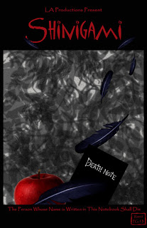
Edited Movie Poster

Last week there were some suggestions to edit my poster so I did. I made the font larger on the title and boled the rest, added the pg-13 sign for fun, and attempted to blur the background a little bit. Sorry if the background is still a little busy, I was having a hard time bluring it up since the blur tool didn't work.