Thursday, December 16, 2010

Final Project

Parady Anime Movie Posters


My first one here is a parady on Fullmetal Alchemist Brotherhood featuring the seven Homunculi Envy, Lust, Greed, Gluttony, Sloth, Wrath, Pride and finally thier Father who created them.  I thought it would be interesting to have all of them hidden in the Oroborus tatoo (don't ask me to spell that) since they all have that symbol on then and marks them for what they are.


Then this one is a parady on Black Cat and features the main villian Creed Diskenth.  I picked the title out because torwards the end of the series when he's in the final battle against the protagonist Train Heartnet i have to admit he is nothing short of it.

Thursday, December 2, 2010

homework

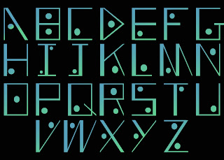
I didn't know which one to go for so here they are...
This one is the first one so it's only in one color. The other two are slight variations of this one.
 In this one I thought that the font would look interesting if it had some color to it so I decided to use the gradient tool in photoshop and make it more interesting.
This last one I was just bored and decided to try to warp it a little bit by squeezing it horizontaly and stretching it vertically. after that I just felt like coloring it red.

Friday, November 12, 2010

laura Migliorino Picture comments

I thought her Marigold Ave picture in her hidden suberbs series was really interesting.  It makes me feel like maybe she's trying to show the people in america that usually get ignored and forgotten.  We're used to seeing celebrities all the time on the tv so we don't really get to see just plain ordinary people much.  So I think she's trying to show that by making the people look transparent, like they're just ghosts in the picture.  Anyway that's kinda what I got out of it but here's a link to see some her artwork.
http://www.lauramigliorinoart.com/index.html

Thursday, October 28, 2010

Foshay Tower Assignment


            Well, this is what I have so far.  For this one I tried to make it look like a cartoon, it took a while to get it to look like this but I think it looks really good.

Then, in this one I wanted it to look like a postcard so I combined a few pictures and edited them a little bit to make them more saturated and chaned the color a little bit.

    This one I haven't finnished yet, there are still a few things that I wanted to do before I color it in so I'll have to update this one later.  For the outline on this one I used the one from the first picture then stretched it a little bit, found a drawing of a bird then outlined that but like i said earlier I'm not done yet so I'll update this later.

Thursday, October 14, 2010

Metaphors We Live By

       I don't know I though it was kinda interesting to find out just how often we use metaphors and don't even realize it.  The discussion in chapter two about time was interesting because it pointed out the fact that our entire society is using these metaphors all the time.

Thursday, October 7, 2010

Homework Assignment

Business Card


   I tried to make this card as simple as possible but still look like something that I would like so the butterflies in the background. Plus, I thought it would be a good idea to have only a few colors so it wouldn't look so busy.

 
15 Artist that inspire me


    1.       navate  2.       Jonatt974  3.       Neovius  4.       Zutun  5.       Squel8  6.       BellaCza  7.       VCTORY  8.       lmmy-is-Thinking  9.       taopal  10.   em3l  11.   warbzz  12.   realityfaery  13.   claudio51  14.   nicc37  15.   chrisntheboat


    The reason why I picked these guys was because thier artwork is great for many different reasons. It makes me want to figure out how to do artworks like thiers. You can find all of these artist on deviantart.com if you want to look at thier artwork.


Artist Statement


   I really like how she had her artist statement written, it had alot of meaning behind it and was well written.  Her first paragraph was really interesting and had alot of depth in it. i kinda feel that it true too.

Friday, October 1, 2010

Edited Movie Poster

Last week there were some suggestions to edit my poster so I did. I made the font larger on the title and boled the rest, added the pg-13 sign for fun, and attempted to blur the background a little bit. Sorry if the background is still a little busy, I was having a hard time bluring it up since the blur tool didn't work.

Thursday, September 23, 2010

Movie Poster


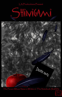
Ok, before I say anything I do not own any rights to Deathnote and that this is purely fan-made.
When I made this I was just bored and wanted to do something with an apple. Why, I don’t really know. It wasn’t until I was messing with the apple idea that this one came and I decided to go with it. I didn’t want the title to be Deathnote or have the story of this movie be about the manga series’ main character Light Yagami. Instead I wanted the story to follow Ryuk or another Shinigami, the Japanese version of the grim reaper, as they ventured out into the human world. So, rather than see things from the humans view like the original series mostly did, the movie would show things from the view of the Shinigami.

Friday, September 10, 2010

Cool Quote

It's sad but true.
I chose this quote because I liked the sound of it and I thought it was funny. Plus, I like being random once in a while and it felt like a good time to be random. For the font I couldn't really pick out one that looked right for "Artificial Intelligence" so I left it all the same. The colors on the font however, give it a sort of crazy feeling to it like the "stupidity" won over "intelligence", so it looks right for the quote.

Thursday, September 9, 2010

Movie Posters


 I don’t know. I like this picture because it gives off an eerie feeling and makes you want to find out why she looks panicked in that poster. The shading in the poster also makes it look dark and menacing like something bad is going to happing or something bad is happening right now.


 This poster I didn’t like because there isn’t enough of a color contrast on the figure or the background. You have pink on pink and blue on blue which makes it difficult to see that there are different shades of those colors on the poster that are creating the shapes like the man’s outfit or the horse’s saddle. There just isn’t enough contrast to see them clearly.

Wednesday, September 1, 2010

The reason why I picked this picture and why it represents me is because when I was in high school one year my friends got this really weird idea to assign flowers/ plants/ rocks to people, some of my friends were picked as sunflowers, pansies, moss and even a boulder for some weird reason and I was picked as a water lily. I don’t really know why they picked that flower for me but it sounded nice so I kept it anyway. This picture has been altered to the way that it is because well, I felt like it and it looks cool this way. It looks different this way and I kind of like things different, it keeps things interesting and make things worth checking out like the House on the Rock in Wisconsin (which is really cool by the way) of the foods at the Minnesota State Fair. Life is more fun and more interesting when you don’t censor yourself from society. Normal is just boring, people want to be normal but then they aren’t happy with themselves. People can only be truly happy when they accept themselves for who they are and not for how society judges them.